Saturday 1 January 2011

week 11 - production for visual communicators - design workflow & novice to expert


 The diagram below shows the novice-to-expert-scale shown in the lecture:


I would describe my self as a beginner as I feel I have working knowledge of key aspects of practice, and can carry out straightforward tasks on my own and I do see things as a series of steps. To progress to the level of “competent”, I will need more background knowledge, have some long-term goals and do more analysis and planning so I can come up with more complex designs.

At first, I thought the way I worked was unorganised but after coming up with a design workflow to show the processes I go through I think that it is pretty organised. However, I feel that I should experiment with colour, font and images much sooner as it could help me to come up with more ideas:


week 10 - how text can influence emotions and change the context of an image

Barbara Kruger creates photo montage and uses text to give the images more meaning.


The text in the images is quite clear most of the time however the word “not” in the following picture is quite small and completely separate in the following image, this makes the viewer question their behaviour and actions.


Duane Michals uses a storyline along with a photograph, this provides the context of the photo and makes the viewer look twice at the image portrayed and think about what is happening in the photograph.


The story is handwritten which makes it seem more personal. It also provides the images more emotion and feeling
-----------------------------------------------------------------------------
Images from:
http://swindlemagazine.com/images/barbara-kruger.jpg

http://www.barbarakruger.com/art/thinking.jpg
http://wwol.inre.asu.edu/.images/barbara_kruger.jpg

https://blogger.googleusercontent.com/img/b/R29vZ2xl/AVvXsEg8-Wt3SSDfsZQXdxjl5OIQ84T6McSDgG9XKfwsgJpOTGwz-malS2As5XFbKtjkYPCS3PTRprbh3e-XgTzOD9myXDlRxK-YpDipKL1CmI0mp57j2iKdsE9dVIdt_QfIVdam4RRkLA_YHH8/s400/duane+michals+salvation.jpg
http://raymondormaza.com/Images/PhotoProof1.jpg

Week 9 - development of creative thought - overcoming mindsets & ideational fluency

Getting rid of assumptions and approaching problems with an open mind are a key part of creative thinking. This can be done by using similes, metaphors and analogies by making an association between objects.
A simile uses likeness to establish a connection where as a metaphor equates the two objects, making the connection more direct. An analogy compares 2 or more completely different things and makes their resemblance in to something similar.


Ideational fluency means ideas that fulfil certain requirements. This can be achieved through tools such as Classification, Brainstorming and Mind-mapping. These tools are used to create a quantity of ideas.
Classification is where ideas can be organised by recognising obvious as well as hidden meanings to create connections. Brainstorming is an opportunity to develop spontaneous thinking and generate more ideas where as mind-mapping allows you to organise the thought processes, and show associations between different thoughts.

I use mind-maps to organise what features to include in a piece of graphic design. Here I have looked at what would be important in a website to assist new students with the university’s learning resource, Moodle;


 ----------------------------------------------------------------------------------
Images from:

Monday 15 November 2010

Week 7 – Production & Outcomes/Influences & Reactions – Medium & Testing


Illustrators utilise both client based, commercially driven projects together with self-initiated and collaborative work, this enables them to use many different mediums to get their work across.
The word “medium” can refer to the medium the illustration is on, for example; paper, canvas, fabric. But in this case it means the way it reaches an illustration reaches its audience e.g. in a newspaper, magazine or on a wall in a museum.

Mike Perry has illustrations crossing many mediums. The illustration below works specifically in a magazine:

The following advertisements for the 2008 Olympics were created in collaboration with Saatchi & Saatchi:

Where as this illustration was designed by Perry alone as a self-initiated piece of illustration:

 
Testing is an area that links in very well with medium. If the medium of an illustrators work is successful in reaching its audience, they can gain feedback for their work.

If the illustrator has a blog they are able to gain feedback through the comments section. A piece of work could then be improved if needed before it is finalised and published. The audience could also provide feedback afterwards, if it was published in the medium of a newspaper or magazine, people could send in their views in an email or a letter. Feedback is important as it allows the illustrator, or any designer, to see if they have been successful in getting their message across. 
-------------------------------------------------------------------------------------------------

Week 6 – Development of Ideas & Structures – 3 Act Structure & Character Design

It has long been said that, “every story needs a beginning, middle and an end” (Jean-Luc Godard). These three parts could also be described as “establish, crisis and resolve”. (These form the basis of the three act structure theory in story development.)
In other words, the characters in the story will begin in a state of equilibrium, something will happen which disturbs the state of equilibrium and starts a sequence of events. At the end of the story the characters come to rest in a new and different equilibrium. In a three act structured story, we usually follow a protagonist, (main character) the end of the first act occurs when the protagonist makes a commitment which leads to the action in the second and third parts.

The three act structure of Disney’s The Jungle Book (1967):
Act 1 – Mowgli has grown up in the jungles of India with a pack of wolves
The wolves learn that Shere Khan (a man-eating Bengal tiger) has come to the jungle and will hunt down Mowgli
The wolves decide Mowgli should return back to a village with other humans as it would be safer for him
Bagheera (a black panther) agrees to take him to the village
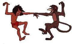
Mowgli meets Baloo (a bear)
Mowgli decides he wants to stay with Baloo and not go back to the village

Act 2 – Mowgli is kidnapped by monkeys
The monkeys take Mowgli to King Louie
Bagheera and Baloo rescue Mowgli
Bagheera convinces Baloo that Mowgli should go back to the village
Baloo tells Mowgli he should return to the village as it’s not safe for him in the jungle
Mowgli runs away

Act 3 – Mowgli comes across a group of vultures
Just as the vultures and Mowgli are becoming friends, Shere Khan appears
The vultures try to hold off Shere Khan
Baloo arrives and also defends Mowgli
Lightning strikes a tree and starts a fire, Mowgli uses the fire to scare off Shere Khan
Bagheera and Baloo take Mowgli back to the village

Character design is also an important part of pre-development.

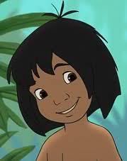
As the protagonist Mowgli is quite young, he looks like he’s around 10 years old. The long scruffy hair and very little clothing reinforces the idea that he grew up in the jungle. He also has quite long limbs, he is able to walk on all fours and interact with all the animals in the story.

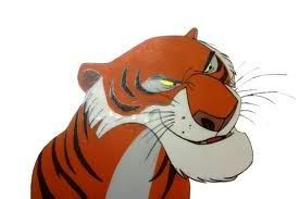
Shere Khan, the villain in this story, looks very sinister in comparison. In the image below, he looks like he has a crooked nose and angry-looking eyes. He doesn’t interact with any of the other characters in a nice way, he is always intimidating them.

Week 5 – Reflective Visual Journal (RVJ) – Work by hand & Reflection

The term “Reflective Visual Journal” can be broken down in three. As it is a “journal” designers use them over a period of time. “Visual” means the designer is able to put their ideas into a visual form e.g. a sketch or an illustration. And finally it enables the designer to be “reflective”, they are able to look back on the ideas and assess whether they have been successful or need changing.

Working by hand in an RVJ is essential for a designer as it enables them to engage a physical connection between the creative thoughts in their mind, their hands and their eyes. Working by hand mainly involves drawing. Drawing enables a designer to think creatively, put down initial ideas and develop these ideas. Anyone who is looking through the RVJ can see the thought process of the designer and the see the ideas develop over time. The image below shows how working by hand plays a key role in the creative thinking process:
Once the ideas have achieved a visual language through the designer working by hand and utilising creativity, the journey of the ideas are nearly at the end of their journey. The designer can then look back on the ideas and he/she can evaluate, question and edit some of the decisions leading to the final design. Reflection isn’t something that occurs just at the end of the journal, it can take place at any stage of the design process.

----------------------------------------------------------------------------------
(Images from the lecture slides)


Monday 25 October 2010

Week 3 - Visual hierarchy & Legibility

“Visual hierarchy” refers to the order in which we see things or what text/images we see first. Many factors in design influence this such as typography, image, colour, size, composition and structure.


This newspaper cover has a visual hierarchy. Immediately you look at either the photograph (the stripes on the flag in the background are eye-catching), or the “Obama Wins” headline, and then the other. Followed by “The Birmingham News” and then all the other smaller text.


I feel that this Look magazine cover lacks a visual hierarchy. There is a lot of information on this cover. Everything seems to be too big and you aren’t sure where to look first. The text for “Look” and “the hottest celebrity news!” is probably the largest as it overlaps the image on the cover; this is what I would see first.

The text of the newspaper is legible, especially the headline as it is large and bold. The text on the magazine cover is also legible. It’s quite important for both of them to use legible font so that their readers are able to read through the magazine/newspaper. If the font style was illegible no one would buy or read either of them.
For example the font in this image looks nice but is quite difficult to read:


However text does not always have to be legible, especially when it is used creatively. For example:


Here the words and letters used aren’t as important as the overall image they create.

------------------------------------------------------------------------------------
Image sources: 
Newspaper: http://www.doobybrain.com/tag/front-page/
Magazine: http://www.magforum.com/look.htm
Magazine font: http://magculture.com/blog/?p=1307
Typographic art: http://www.canvasgrafix.com/wp-content/uploads/2010/04/Typographic_Portrait_by_PopeyeFrancom.jpg
http://www.jhuskisson.com/tag/inspiring