Monday 15 November 2010

Week 7 – Production & Outcomes/Influences & Reactions – Medium & Testing


Illustrators utilise both client based, commercially driven projects together with self-initiated and collaborative work, this enables them to use many different mediums to get their work across.
The word “medium” can refer to the medium the illustration is on, for example; paper, canvas, fabric. But in this case it means the way it reaches an illustration reaches its audience e.g. in a newspaper, magazine or on a wall in a museum.

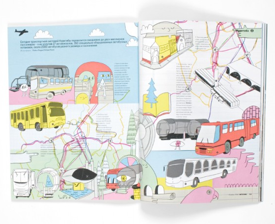
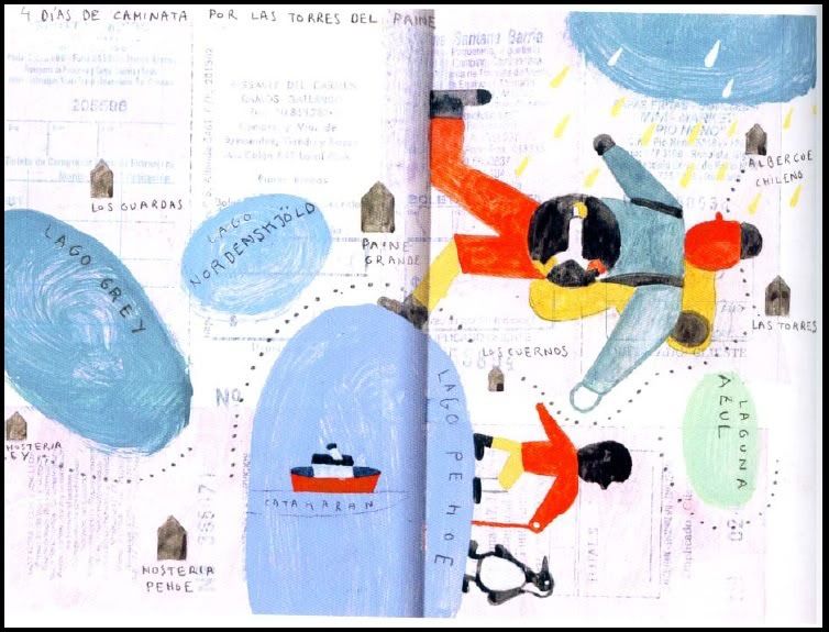
Mike Perry has illustrations crossing many mediums. The illustration below works specifically in a magazine:

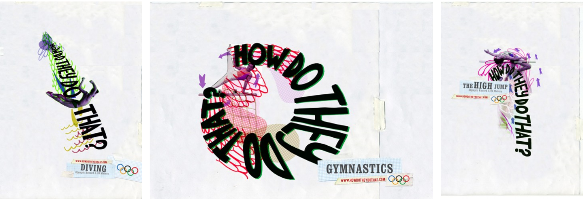
The following advertisements for the 2008 Olympics were created in collaboration with Saatchi & Saatchi:

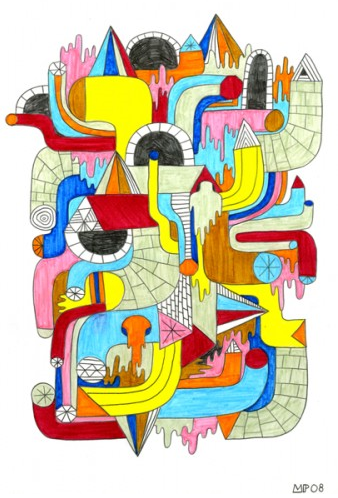
Where as this illustration was designed by Perry alone as a self-initiated piece of illustration:

 
Testing is an area that links in very well with medium. If the medium of an illustrators work is successful in reaching its audience, they can gain feedback for their work.

If the illustrator has a blog they are able to gain feedback through the comments section. A piece of work could then be improved if needed before it is finalised and published. The audience could also provide feedback afterwards, if it was published in the medium of a newspaper or magazine, people could send in their views in an email or a letter. Feedback is important as it allows the illustrator, or any designer, to see if they have been successful in getting their message across. 
-------------------------------------------------------------------------------------------------

Week 6 – Development of Ideas & Structures – 3 Act Structure & Character Design

It has long been said that, “every story needs a beginning, middle and an end” (Jean-Luc Godard). These three parts could also be described as “establish, crisis and resolve”. (These form the basis of the three act structure theory in story development.)
In other words, the characters in the story will begin in a state of equilibrium, something will happen which disturbs the state of equilibrium and starts a sequence of events. At the end of the story the characters come to rest in a new and different equilibrium. In a three act structured story, we usually follow a protagonist, (main character) the end of the first act occurs when the protagonist makes a commitment which leads to the action in the second and third parts.

The three act structure of Disney’s The Jungle Book (1967):
Act 1 – Mowgli has grown up in the jungles of India with a pack of wolves
The wolves learn that Shere Khan (a man-eating Bengal tiger) has come to the jungle and will hunt down Mowgli
The wolves decide Mowgli should return back to a village with other humans as it would be safer for him
Bagheera (a black panther) agrees to take him to the village
Mowgli meets Baloo (a bear)
Mowgli decides he wants to stay with Baloo and not go back to the village

Act 2 – Mowgli is kidnapped by monkeys
The monkeys take Mowgli to King Louie
Bagheera and Baloo rescue Mowgli
Bagheera convinces Baloo that Mowgli should go back to the village
Baloo tells Mowgli he should return to the village as it’s not safe for him in the jungle
Mowgli runs away

Act 3 – Mowgli comes across a group of vultures
Just as the vultures and Mowgli are becoming friends, Shere Khan appears
The vultures try to hold off Shere Khan
Baloo arrives and also defends Mowgli
Lightning strikes a tree and starts a fire, Mowgli uses the fire to scare off Shere Khan
Bagheera and Baloo take Mowgli back to the village

Character design is also an important part of pre-development.

As the protagonist Mowgli is quite young, he looks like he’s around 10 years old. The long scruffy hair and very little clothing reinforces the idea that he grew up in the jungle. He also has quite long limbs, he is able to walk on all fours and interact with all the animals in the story.

Shere Khan, the villain in this story, looks very sinister in comparison. In the image below, he looks like he has a crooked nose and angry-looking eyes. He doesn’t interact with any of the other characters in a nice way, he is always intimidating them.

Week 5 – Reflective Visual Journal (RVJ) – Work by hand & Reflection

The term “Reflective Visual Journal” can be broken down in three. As it is a “journal” designers use them over a period of time. “Visual” means the designer is able to put their ideas into a visual form e.g. a sketch or an illustration. And finally it enables the designer to be “reflective”, they are able to look back on the ideas and assess whether they have been successful or need changing.

Working by hand in an RVJ is essential for a designer as it enables them to engage a physical connection between the creative thoughts in their mind, their hands and their eyes. Working by hand mainly involves drawing. Drawing enables a designer to think creatively, put down initial ideas and develop these ideas. Anyone who is looking through the RVJ can see the thought process of the designer and the see the ideas develop over time. The image below shows how working by hand plays a key role in the creative thinking process:
Once the ideas have achieved a visual language through the designer working by hand and utilising creativity, the journey of the ideas are nearly at the end of their journey. The designer can then look back on the ideas and he/she can evaluate, question and edit some of the decisions leading to the final design. Reflection isn’t something that occurs just at the end of the journal, it can take place at any stage of the design process.

----------------------------------------------------------------------------------
(Images from the lecture slides)


Monday 25 October 2010

Week 3 - Visual hierarchy & Legibility

“Visual hierarchy” refers to the order in which we see things or what text/images we see first. Many factors in design influence this such as typography, image, colour, size, composition and structure.


This newspaper cover has a visual hierarchy. Immediately you look at either the photograph (the stripes on the flag in the background are eye-catching), or the “Obama Wins” headline, and then the other. Followed by “The Birmingham News” and then all the other smaller text.


I feel that this Look magazine cover lacks a visual hierarchy. There is a lot of information on this cover. Everything seems to be too big and you aren’t sure where to look first. The text for “Look” and “the hottest celebrity news!” is probably the largest as it overlaps the image on the cover; this is what I would see first.

The text of the newspaper is legible, especially the headline as it is large and bold. The text on the magazine cover is also legible. It’s quite important for both of them to use legible font so that their readers are able to read through the magazine/newspaper. If the font style was illegible no one would buy or read either of them.
For example the font in this image looks nice but is quite difficult to read:


However text does not always have to be legible, especially when it is used creatively. For example:


Here the words and letters used aren’t as important as the overall image they create.

------------------------------------------------------------------------------------
Image sources: 
Newspaper: http://www.doobybrain.com/tag/front-page/
Magazine: http://www.magforum.com/look.htm
Magazine font: http://magculture.com/blog/?p=1307
Typographic art: http://www.canvasgrafix.com/wp-content/uploads/2010/04/Typographic_Portrait_by_PopeyeFrancom.jpg
http://www.jhuskisson.com/tag/inspiring

Sunday 24 October 2010

Week 2 - Practice - Jill Calder


As mentioned previously, inspiration can come from other artists and designers work. Ideas can also come through “visual practice”, which can be broken down into; “visual” i.e. observation, studying, exploring and “practice”, putting what we have seen/studied onto paper. Jill Calder’s illustrations are a good example of this. As an illustrator, she observes her surroundings, the environment as well as the people around her, she is able to produce detailed illustrations such as these in her sketchbook:


This shows that observing, exploring and studying your subject can help you to focus on details.
The illustrations also show experimentation. Calder has used different materials to produce each of the illustrations above which shows experimentation is key to the development of a ‘personal’ visual vocabulary. Using different materials can add a different look to the illustrations. For example the sketch of the dog has a different feel to it compared to this:


The following illustration also shows the difference materials can make.

The box on the left and on the right could be of the same scene or completely different ones, it’s hard to tell because of the materials used. The illustrator has used a bolder, darker material for the box on the right, where as the drawing in the left box is finer and Calder has used more detail in this box such as facial expressions.

---------------------------------------------------------------------------------------------------------------------------
Sources:
http://www.jillcalder.com/jillcalder_sketchbook.php 

Monday 4 October 2010

Week 1 - Notions of originality & recontextualised ideas - Piet Mondrian

Piet Mondrian's (1872-1944) early work was inspired by Cubism. Eventually he began painting complete abstracts consisting of white spaces, black lines which form rectangles and have been coloured in the primary colours red, yellow and blue. He called this style of non-representational art Neo-Plasticism.

[Piet Mondrian. Composition with Blue, Red and Yellow. 1930]

He directly influenced another artist, Theo van Doesburg (1883-1931), who also adopted this style of painting with the exception that Doesburg also included diagonal lines which formed diamond-shapes. Together they created the De Stijl (“The Style”) movement.

[Theo van Doesburg. Contra Composition XVI. 1925]

The fashion designer Yves Saint Laurent (YSL) was also inspired by the pattern and colours of Mondrian's painting in the design of this dress in their 1965 Autumn collection.


One could argue that the pattern on the dress is not original as we have seen it before as a painting. However, the pattern and colours have been taken out of a fine art context and applied in the medium of fashion to create another original design. This allows people to see the painting in a different way and makes it accessible to a different group of people. For example, the painting would have interested artists, designers and art enthusiasts, where as the dress would be viewed by fashion designers, women, fashion enthusiasts, etc.

The style was recently revisited in 2008 by other designers such as Nike (trainers) and Kara Ross (handbag):


The Nike trainers do not use the straight lines and rectangles but have chosen the same colours as Mondrian’s paintings. This would attract yet another group of people. They are shoes designed for a new generation; a younger, youthful group who may or may not be interested in modern art but are being exposed to the designs of Mondrian.

The designs by Mondrian have been used and reused by people applying the pattern and colors to objects in a similar way to YSL's dress. His designs are still popular in many ways and will probably continue to influence artists and designers.